|
|
 2006 - Paintings by: Keith
 |
|
|
2006 - Paintings by: Keith |
|
last
update Nov 3 - 2006
|
for
best viewing check your monitor color balance:
click here for information
Scroll Down for Larger Views
|
 |
 |
 |
 |
 |
 |
 |
 |
 |
 |
 |
 |
 |
 |
 |
 |
 |
 |
 |
 |
 |
 |
 |
 |
 |
 |
 |
 |
 |
 |
 |
 |
 |
 |
 |
 |
 |
 |
 |
 |
 |
 |
 |
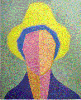
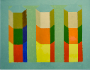
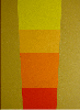
20 x 16 acrylic on canvas |
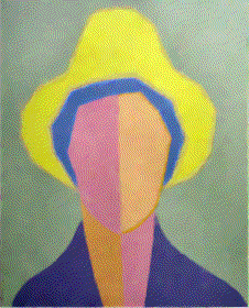
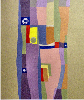
Woman in Yellow Hat
2
I have always been interested in flat shapes. The colour yellow is the subject of this painting yet there was a requirement to maintain a link with the naturalistic world. This is more of a bridge painting. It reduces the natural world to semi-objective flat shapes thus providing a bridge between naturalistic and non-objective painting. It has been said that many figurative painters eventually find their way to the non-objective world. The pull to the non-objective world is pure freedom from the imitating the visual effects of the natural world. It is a world where each artist makes his or her own rules but, not every artist or person wants that kind of freedom |
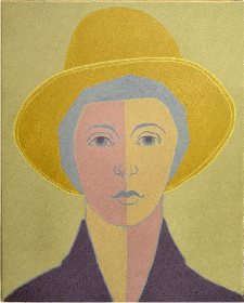
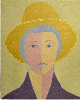
20 x 16 acrylic on canvas |
Woman in Yellow Hat 3 Continuing my flat shape studies with a third
version of Woman in a Yellow Hat. The concept of broken colours should be explained. Primary colours are yellow, red, blue in decending tone from light to dark. Secondary colours are mixtures of any two primary colours eg. green equals yellow and blue. Tertiary colours are mixtures of any three primary colours eg. green and orange. Over the decades people changed the name tertiary to broken and used tertiary to mean the mixture of eg. green with yellow to produce a yellow green which used to be known as an intermediate colour. |
20 x 24 inches: acrylic on canvas |
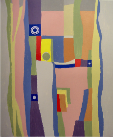
Started working on this while listening to a C.B.C. Radio programme titled 'Ideas' They talked about how we train ourselves to hear only one scale of musical sounds and yet there are many more sounds that we filter out. I began thinking about vertical acending watery quality of dominant and varying shapes linked and separated through both shape style variety and intensity of colour. At some point in the future I will overlay more floating things working towards a calm but spacially active composition. |
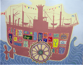
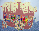
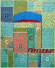
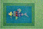
My LIttle Toy Boat |
My Little Toy Boat Used ancient symbols but even letters of the alphabet could be used - its an eye dance area that acts as a contrast to the other more quiet areas. Its a compositional technique derived from picturesque painting. The paddle wheel is the main focal point - low down on the vertical axis - the eye starts and ends there. I had been reviewing spot design and its attention strength in the visual field when I started this painting. |
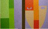
18 x 24in : acrylic on canvas |
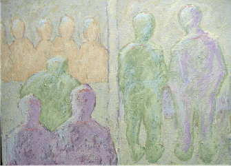
Mens Pee Que I began with more detail in the figures but the detail kept jumping the eye movement so I started laying paint over paint slowly reducing the detail to general shapes. You can sense the thick overlays of paint from the image. It is less controlled than my previous paintings.
Its an approach that I feel comfortable with - have to see what it develops
into. |
| A few notes: In my previous paintings there is a
clear separation between shape colour and tone. The tonal range has narrowed.
The shape fill and edges are ruff as opposed to smooth. The colours are
more closely related in tone and chroma. Compositionally the painting is
divided in half with more weight given to the lower left. There is a strong
horizontal format movement countered with the figure verticals. General shapes which can be interpreted as human are moulded from the light end of the tonal and colour scale. Orange Green and Violet figures have entered a temporary collective existance node. In subject context they are all strangers culturally trained into using a semi-private same sex public urination facilitity for their biological need. The painting as little carrying power when viewed from across a room. It must be approached for close up viewing of its subtle colour and ruff texture which brings the figures into this public but private world. Some studies indicate that some men take a little longer to psychologically activate their urination system in public than in private. |
18 x 14 inches: acrylic on canvas |
Yack-Yack A task force was set up, I was a member of the yes-sidewalk team. Yack Yack and M-457 were members of the no-sidewalk team- there were other members which I may or may not interpret in paintings. Yack-Yack ; M-457 and others realized their arguments made themselves appear selfish so they changed to saying that other areas of the city were more worthy of a sidewalk than they. This made it sound like they were giving away their sidewalk and not a community sidewalk. A classic passive aggressive behaviour example. After all 69% of the community voted in favour of the safe sidewalk passage. |
| The large colour areas are based upon a neutralized orange, green, violet secondary triad. A smaller more chromatic detail traid of primary colours, yellow, red, blue are used for accents. The brush work is loose compaired to earlier paintings. |
16 x 20 inches: acrylic on canvas |
Stone Age 001: The top two stones have smoother hand worked surfaces compaired the bottom three stones. The painting symbolizes the human ability to influence and shape the primordial material into protective structures. |
24 x18 inches: acrylic on canvas |
Primordial Age 001: The idea was to focus my mind on fluid molten
material and using my sketch for reference quickly execute the design
with little conscious thought interference. There are some changes I would make but that is for the next time. I would like to incorporate some type of metal. Yes I recognize the sexual metaphor. |
20 x24 inches: acrylic on canvas |
Ideas 002 Rain Shapes The main design edges of Ideas 001 have been removed to simplify the vertical eye flow making int less complex. Compare this design with 001 to identify the difference. |
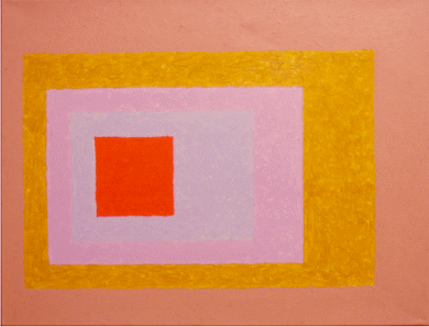
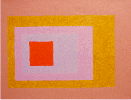
14 x18 inches: acrylic on canvas |
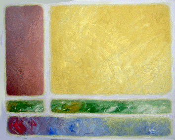
Flat Scape 001: The Albers influence can be easly seen in this composition. It was created as a colour mixing exercise for my students. It uses a simple composition in terms of subdividing the support - colour mixing is applied for skill development in constructing and identifying hue, value, chroma and quality attributes. The result is a small composition that applies colour field painting theory with soft and sharp edge design. |
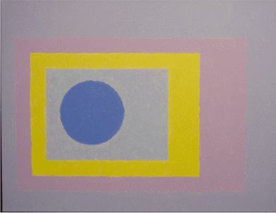
14 x18 inches: acrylic on canvas |
Flat Scape 002: The General format and size remains the same for this series. The central area of the composition will vary
in graphic content to provide some variety between paintings. This allows
for the colour mixing exercises to be composed as a series. |
14 x18 inches: acrylic on canvas |
Flat Scape 003:
|
14 x18 inches: acrylic on canvas |
Flat Scape 004:
|
14 x18 inches: acrylic on canvas |
Flat Scape 005:
|
16 x20 inches: acrylic on canvas |
Flat Scape 006: The constant philosophical debate in painting
is between the illusion of form and the representation of form. I prefer
to remain in the representation mode which lets the viewer easely recognize
that the painting is a construct and not an illusion.
|
14 x18 inches: acrylic on canvas |
Flat Scape 007: Created as an exercise in colour mixing .
|
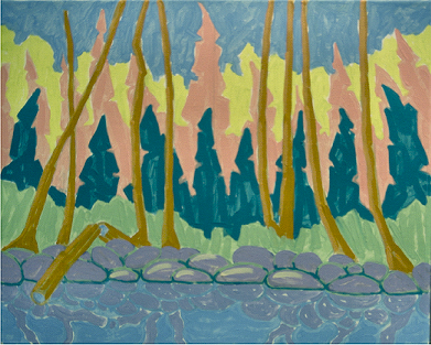
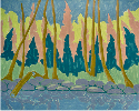
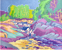
16 x20 inches: acrylic on canvas little round lake: Algonquin Park: Ontario Canada |
Flat Scape 007: Needed a break from all that geometry. This was designed as an exercise to illustrate how flat shapes and bright clear colours can be applied to create an uplifting mood to an otherwise shabby uninteresting forest and lake. I used this as an example for my class.
|
16 x20 inches: acrylic on canvas |
Flat Scape 008: This was designed as a colour mixing exercise example for my class.
|
16 x20 inches: acrylic on canvas |
Flat Scape 009: My left eye is legaly blind and my right eye has developing cataracts. Cataracts cause your visual field to become mottled with soft grey clouds (the grey in the painting does not show up as grey in the reproduction). I used a coloured stone pattern and light greyed some of the stones to create holes. Over time the visual field begins to disintegrate in a mottled fashion thus creating an interesting pattern. Eventually I will get the condition fixed but
meanwhile there appears to be some interesting compositional painting
ideas in it. |
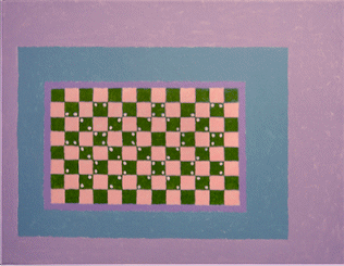
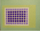
20 x16 inches: acrylic on canvas |
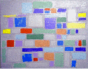
Flat Scape 010 The dots create and stress a consistant surface
texture like plane fabric. The dots, all of the same colour enter into
a simultanious contrast reaction with the dirrerent colour toned rectangles. |
20 x16 inches: acrylic on canvas |
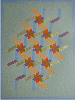
Flat Scape 011 Another exercise in flat shapes and tone control.
The flowers are in the warm range and the ground is in the cool range. |
18 x24 inches: acrylic on canvas |
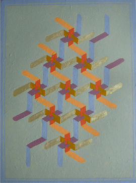
Flat Scape 012 Have come full circle. My tean years interest
turned to celtic knot patterns which I transposed into oil painings. Now my interest has turned to isometric designs transposed into acrylic paintings. My childhood enjoyment of looking at the wold
through prisms, facination with everything that glittered and love of
the flat local colour used in illuminated manuscripts appears to have
merged. It is the essence of a style that demands the silent inner integrity of a monk constantly challenged to choose the easy way . There is no tool kit of arty tricks behind which to hide - every lapse of focus shows. |
14 x18 inches: acrylic on canvas |
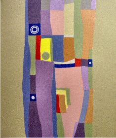
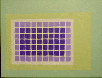
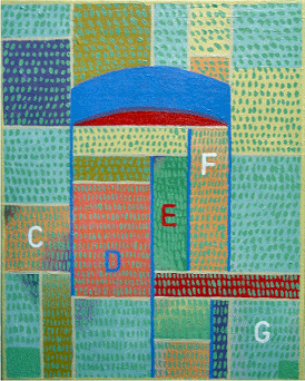
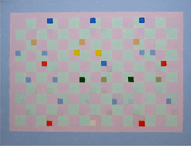
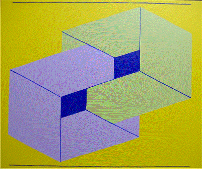
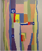
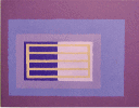
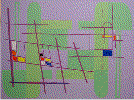
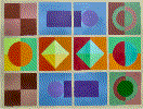
Flat Scape 014 Flatland Government Two ruling councils. The yes! council (dark squares
at top). The no! council (dark squares at bottom) There was agreement that three scientists (middle
three dark squares) would resolve the impasse by finding a way to enter
the three dimensional world where contradictory decisions could coexist. |
20 x16 inches: acrylic on canvas |
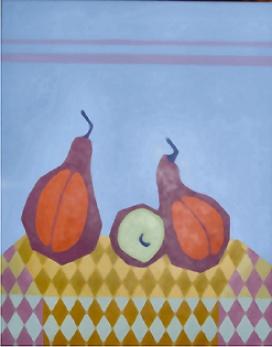
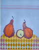
Flat Scape 015 Two Red Pears and one lemon Painted this with too much space at the top: the format should have been closer to that of a square. The top edge tension was increased by painging a border along the top. Yes anametic charastistics were used in this
subject composition and design. |
18 x 24 inches: acrylic on canvas |
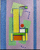
Flat Scape 016 Red Horn: This is to me a watershed painting. It looks simple but I struggled with the shapes and colours for days. The objective was to create a simple composition that would bring colour to drab areas of a home and yet not be of gallery dimensions. It simplifies my study of flat colour shapes and evolved into a painting that funcionsas as a quiet coloured light to be experienced in passing but not to be contemplated. |
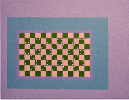
2x (18 x 14) inches: acrylic on canvas |
Flat Scape 017 Self Portrait with Lilacs This is painted on two separate canvases each
18 by 14 inches. It continues the simple ideas. The rectangular shapes of each section have been mirrored and rotated causing the eye to move diagionally between the section parts as on a checker board. It may be of interest to know that my left eye is legaly blind and my right eye has soft grey clouds of cataracts. |
20x16 inches: acrylic on canvas |
Flat Scape 018 Lilacs The surface of a blank canvas has a unity all its own. During the painting process our surface marks disturb the original unity. Our struggle with shapes and colours continue to disturb the original unity until we establish a new unity. In this new unity I seek a quiet arrangement based upon the principles of notan. There is a quality to this work that reminds me of magic realism only without the realism. It would normally fall into the catch all catagory of abstract expressionism it seems to define itself as magical abstraction.
|
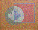
16x20 inches: acrylic on canvas |
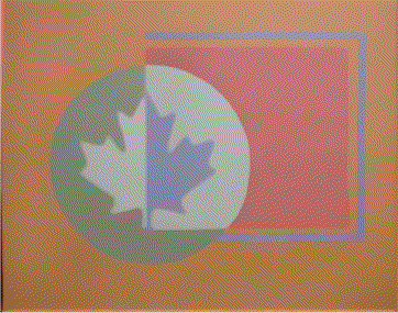
Flat Scape 019 O'Canada This started out as an exercise in applying opaque colour to create a transparent design. I had this maple leaf cutout hanging around the studio so I decided to make the circle a bit more interesting by adding the maple leaf to the problem. The circle had acquired some interest by adding the leaf but the square didn't so I added three blue structural lines around the outside of the square.
|
20x24 inches: acrylic on canvas |
Flat Scape 020 Dance of the Lilacs Inspired from looking at my lilac bush as a geometrical notan type subdivision of the pictorial format with three colour tones. The linear structural movement was based upon my childhood playing with pick-up-sticks. Coloured bits were based upon ceramic tiles. I wanted to combine movement, structure, colour and calmness. |
20x24 inches: acrylic on canvas |
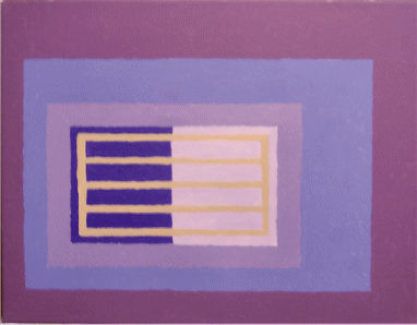
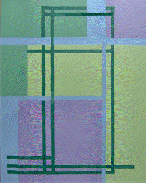
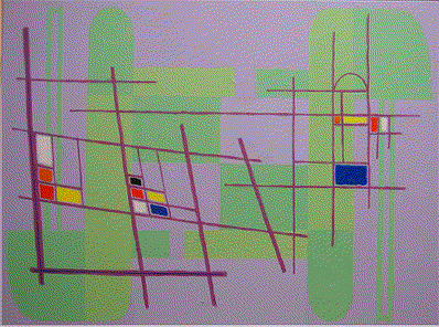
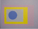
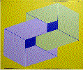
Flat Scape 020 Two Thoughts Philosophical art. Illustrates how the human mind can coexist with two separate thoughts. The lower box points downwards and the upper box points in the upward direction. The upper box merges more with the background than the lower box - symbolizing how the human brain can be programmed to give more importance to one contradictory thought than another - yet the subordinated thought always remains as a darkness. |
20x16 inches: acrylic on canvas |
Flat Scape 021 2006 June No. 3 Red Disk Arrival Albers Kandinsky and Klee are still churning round in my head. Have just added Itten to the mix. Have recently begun studying imposed town planning and organic town growth throughout the ages. Don't want my linier layer to become mechanical All this may boil down to the reality that I have become more conscious of living during a time when multi-dimensions of space time configurations are being discussed. |
16x20 inches: acrylic on canvas |
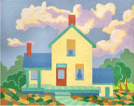
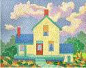
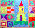
2006 Farm House This painting has been composed using flat colour shapes. The objective is to maximise the use bright happy colours to lift the spirits of the viewer. Most viewers refer to it as a fun painting. |
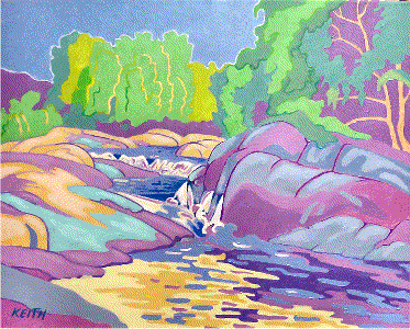
16x20 inches: acrylic on canvas |
2006 Water Falls Another painting in which I play with flat colour and allow the lines and shapes to provide the illusion of rounded forms.. |
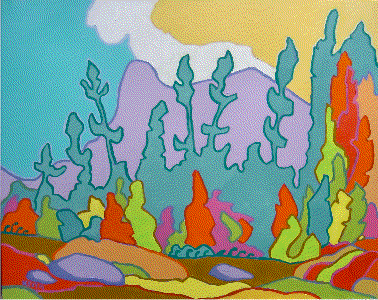
16x20 inches: acrylic on canvas |
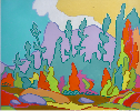
2006 Fall Forest Another painting in which I play with flat colour shapes. This was painted for my students as an exercise. |
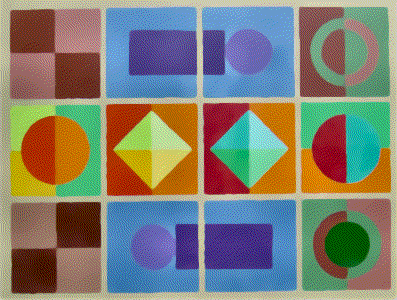
14x18 inches: acrylic on canvas |
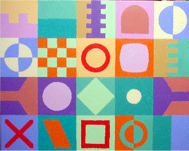
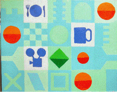
2006 Op Art Using Vasarely as a source to produce a series of colour mixing and flat painting exercises for my students resulted in this first composition. |
16x20 inches: acrylic on canvas |
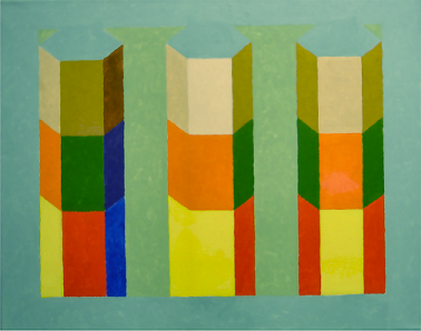
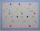
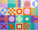
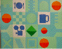
2006 Test Module 1 Testing various cell shapes and colours |
16x20 inches: acrylic on canvas |
2006 Test Module 2 Testing various cell shapes and colours |
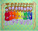
20x16 inches: acrylic on canvas |
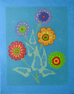
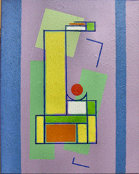
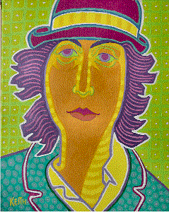
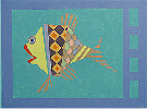
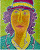
2006 Flower Girl Hadn't played with a portrait in quite a while so I jumped in. Line is used in place of shading . All shapes are flat filled. |
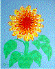
20x16 inches: acrylic on canvas |
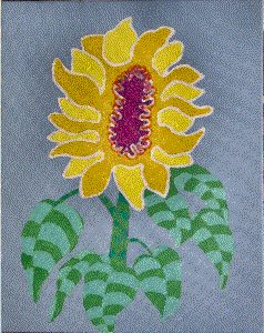
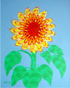
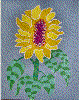
2006 Sun Flower The leaves are flat painted but the shape gives the impression of rounded form. |
16x20 inches: acrylic on canvas |
Mural: sample: module: Vasarely's influence has evolved into a modified system which matches my own temperment. It has been written that inexperienced artists copy and experienced artistists steal to the point where the ideas become their own - in some cases better than the originator of the ideas. This system will be applied to a four foot by eight foot mural. |
16x20 inches: acrylic on canvas |
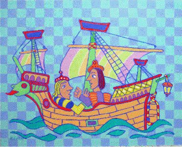
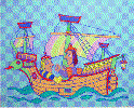
Medieval Ship Have been planning a medieval series for a number
of years. |
20x16 inches: acrylic on canvas |
Full Bloom Had to finish this up as it had been hanging around the studio for a while. |
16x20 inches: acrylic on canvas |
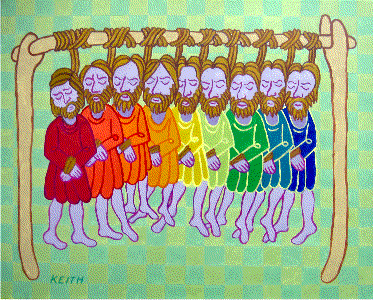
Medieval Hanging Another in this series that I keep thinking about.
|
 .
.